Behind Toonkit
Your Own AI Animation Studio, Reimagined
 Team ToonkitViews —


Hello, Toonkit team here!
If you've used Toonkit before, you may have noticed that our main screen has changed quite a bit recently.
With this update, we've redesigned Toonkit's workspace to make it easier to explore our content and create the animations you want. We've made improvements across the overall UI and user experience to make the creative process more intuitive and convenient.
For those visiting Toonkit for the first time, this new design will be your first impression of Toonkit. For our existing users, we'd love to hear what you think as you look through the changes below. In particular, we're curious to know if there's anything from the previous UI that you wish we had kept.
Even small comments can be helpful, so please feel free to share your thoughts with us. We'll continue working to create a more convenient and enjoyable AI animation creation experience based on your feedback.
1. A Cleaner, More Intuitive Header Navigation
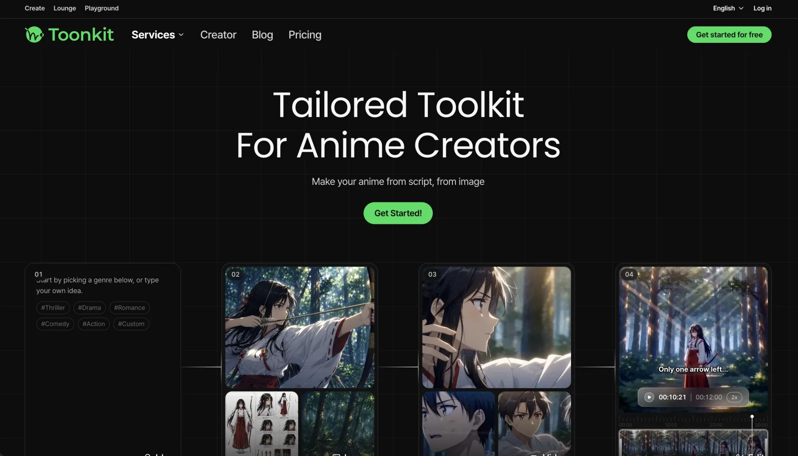
Before the update, visitors to Toonkit's landing page were greeted by a two-row header UI, as shown above.
We wanted to showcase as many of Toonkit's features and pages as possible at a glance, so we packed a lot of information into the header. While this made it easy to quickly find different features, it could also feel somewhat complex, especially for first-time visitors.
Non-members could also access the Playground and explore various images and videos created by existing users.
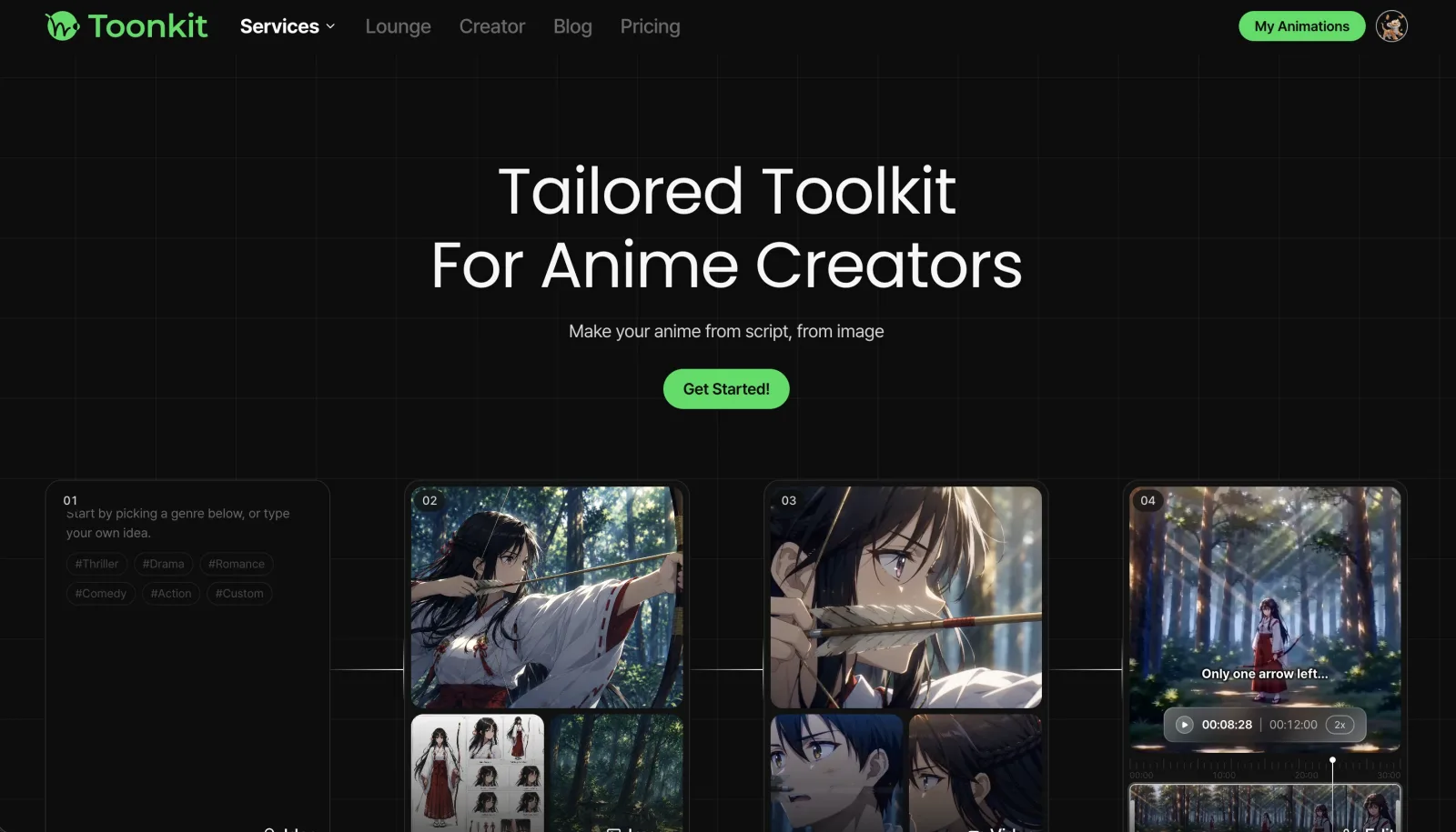
Now, when you visit the landing page, you'll see a much cleaner, streamlined, single-row header navigation.
In particular, the Services tab makes it easy to see all the services Toonkit offers at a glance. We've also reorganized the navigation around pages that are accessible regardless of whether you're logged in, making it easier for both members and non-members to find the pages they need.
Rather than displaying as much information as possible all at once, we've focused on creating a simpler and cleaner structure that makes the pages you need more intuitive to find.
2. A More Clearly Defined Personal Animation Workspace
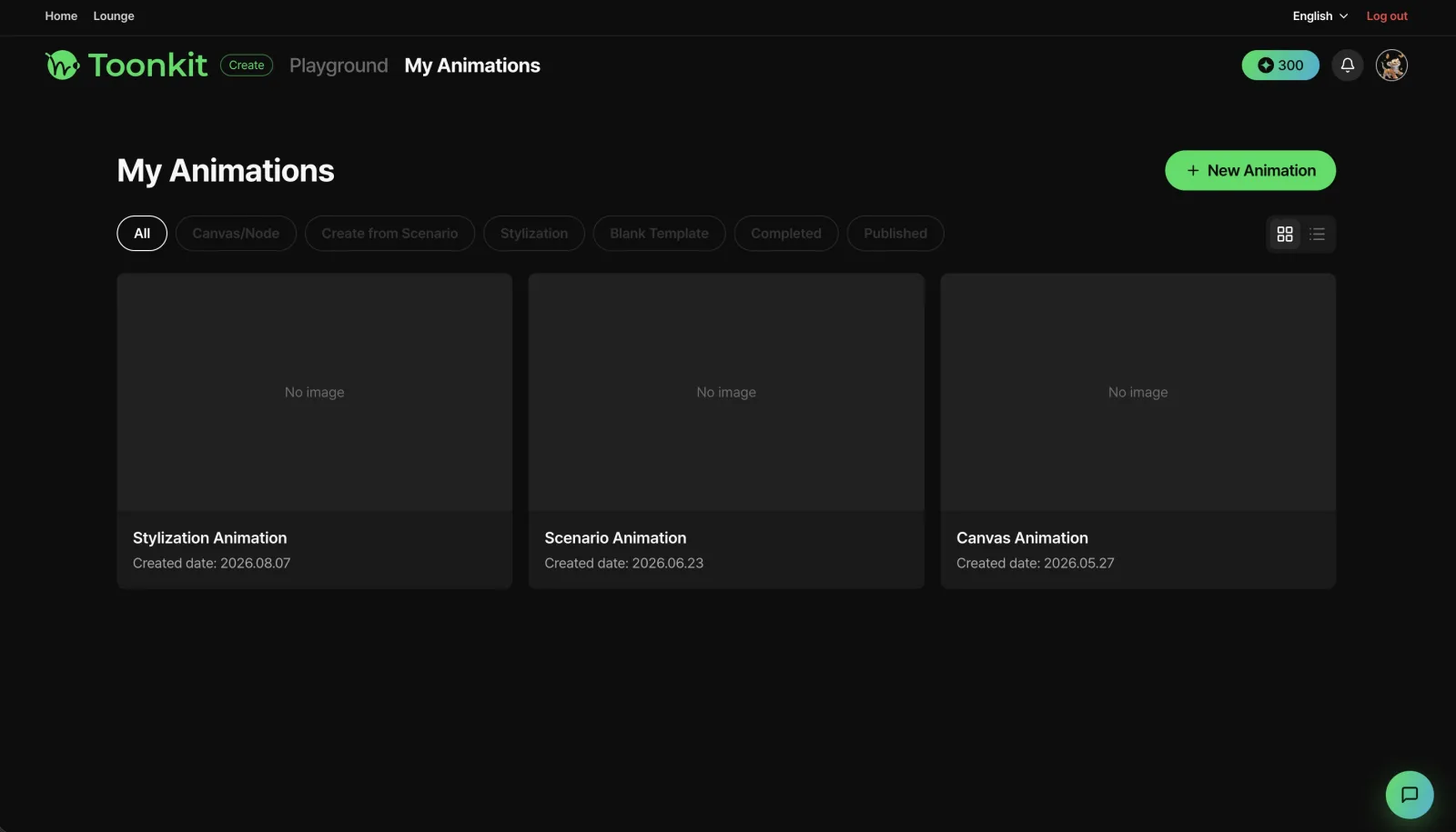
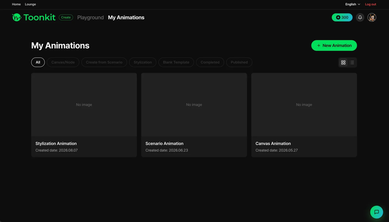
After logging in, users could access the My Animations page, where they could find all of the animations they had been working on.
The previous UI was intentionally simple, allowing users to view all of their ongoing animations at a glance and jump directly into any project to continue editing. The header navigation was also the same two-row structure used on the landing page, making it easy to move between pages and check information such as your remaining credits.
However, because the same header structure was used as on the landing page, we felt that it didn't fully convey the feeling of entering your own workspace for creating and managing animations, nor did it provide enough opportunities to explore the various features available in Toonkit.
With this redesign, we wanted to make the My Animations page more than just a place to store your projects. We redesigned it as an independent workspace where you can create and manage your own animations, making that distinction much clearer.
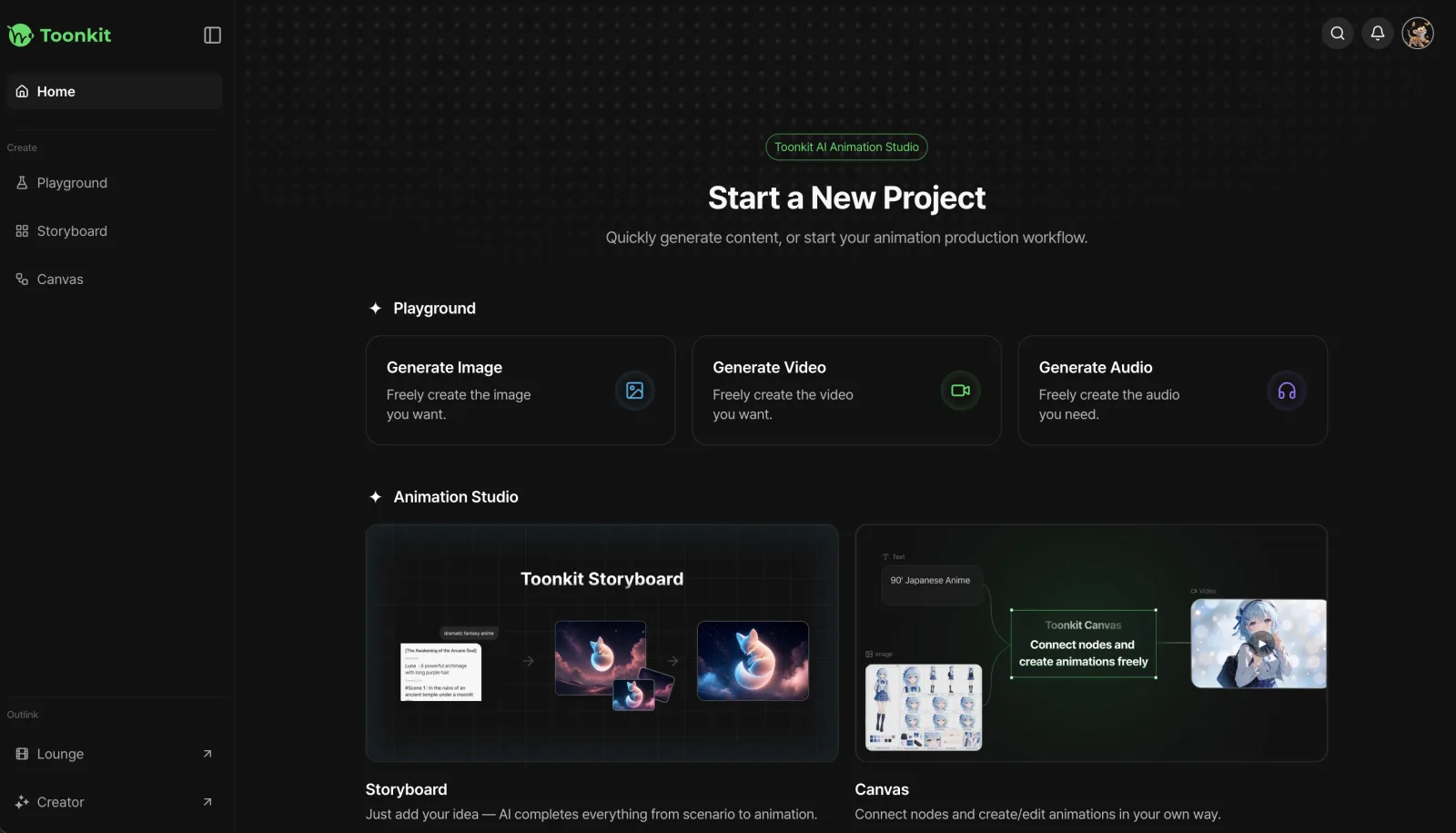
As part of this redesign, we've also added a new home screen that you'll see immediately after logging in.
Previously, you would go to the My Animations page to view your projects or click the Add Animation button to start a new one. Now, the home screen lets you jump directly into a variety of creative workflows.
You can not only start a new animation, but also access various features available in the Playground directly from the home screen. Need an image? Go straight to Image Generation. Want to create a video? Jump directly to Video Generation. Need a voice? Go directly to Voice Generation with a single click.
You can also start creating an animation from a story, or begin an animation project using a node-based workflow. We've redesigned the home screen so you can choose the workflow that best fits your creative process and get started right away.
The home screen header has also been simplified to focus on frequently used features such as your profile, notifications, and search. Page navigation has been neatly organized through the sidebar.
The sidebar can also be customized to match your preferred workflow. You can choose between a compact sidebar that displays icons only and a wider sidebar that displays both icons and page names, allowing you to set up your workspace the way you prefer.
At the bottom of the home screen, you can also see a list of your most recently worked-on animations, allowing you to select a project and jump right back into your creative process.
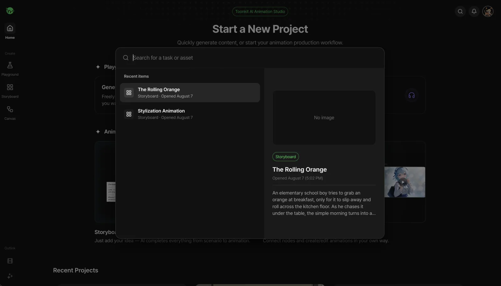
Clicking the search button in the header lets you search through all of your animations, not just your most recent projects.
Once you find the animation you're looking for, simply click it to go directly to the corresponding workspace. This makes it easy to find older projects and continue working on them whenever you want.
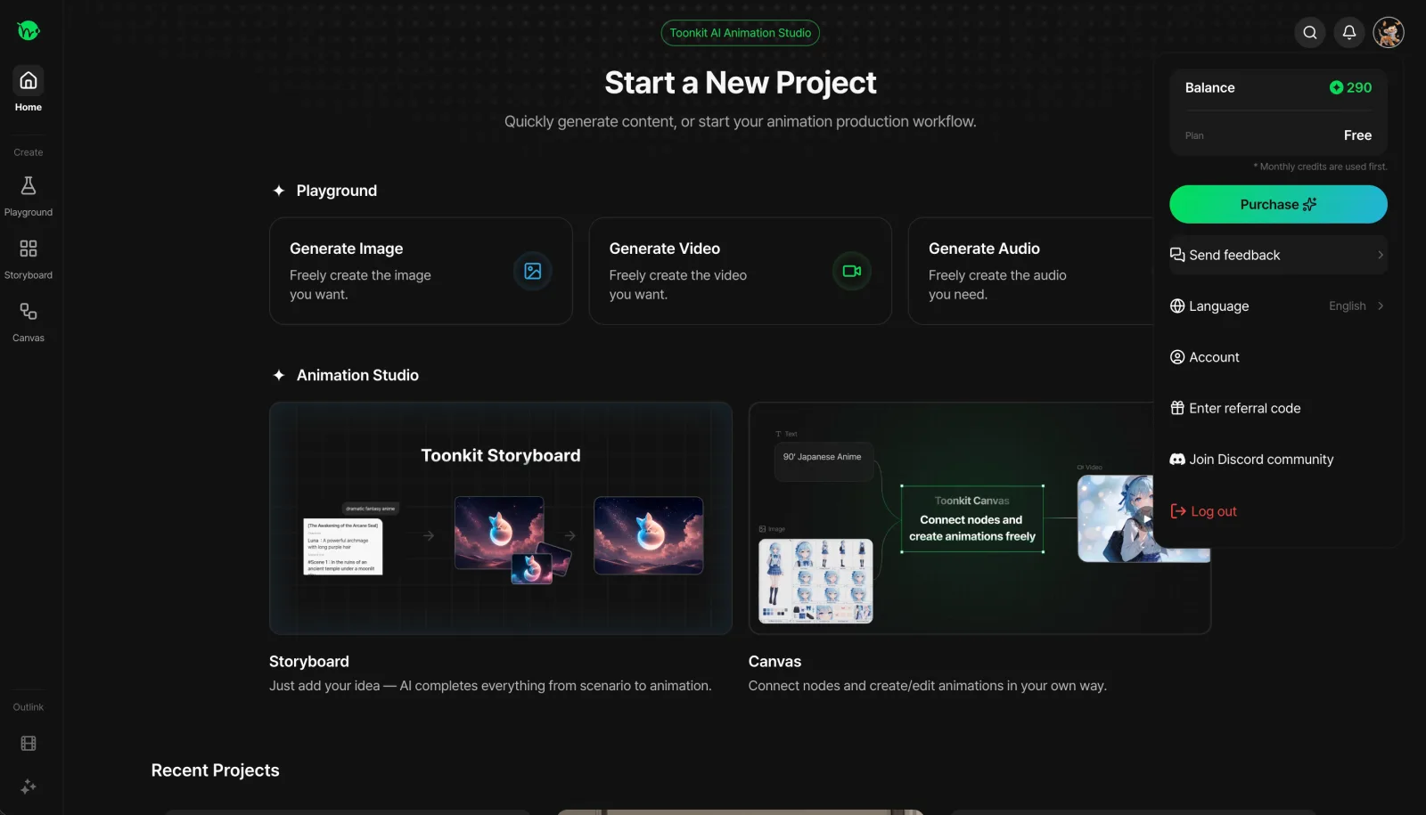
Clicking your profile in the header lets you check your remaining credits at a glance.
You can also change your subscription plan or purchase additional credits whenever needed, allowing you to manage your account and billing without having to navigate to a separate page.
If you encounter a bug or something that feels inconvenient while using the service, you can also use the Send Feedback button to share your thoughts directly with the Toonkit team.
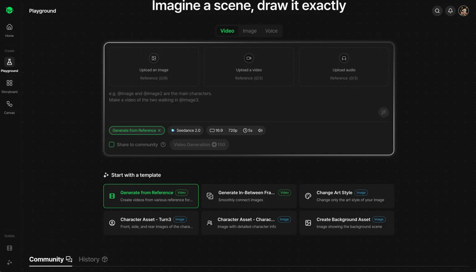
We've also redesigned the Playground to help you stay more focused on your creative work.
Previously, you would work on generation tasks on the left side of the screen while the right side displayed your work history or a Community tab featuring images and videos created by other users. While this made it easy to explore different content at a glance, having multiple areas visible at once could make it harder to fully focus on the creation process.
With the redesign, we've placed the generation workspace in the center of the screen, giving you a wider and more comfortable area to work in. Your work history and community content can now be accessed from the bottom of the screen.
We've also added templates that let you start creating immediately based on the type of content you want to make. Simply choose the template you need and jump straight into the generation process, making it faster and easier to get started.
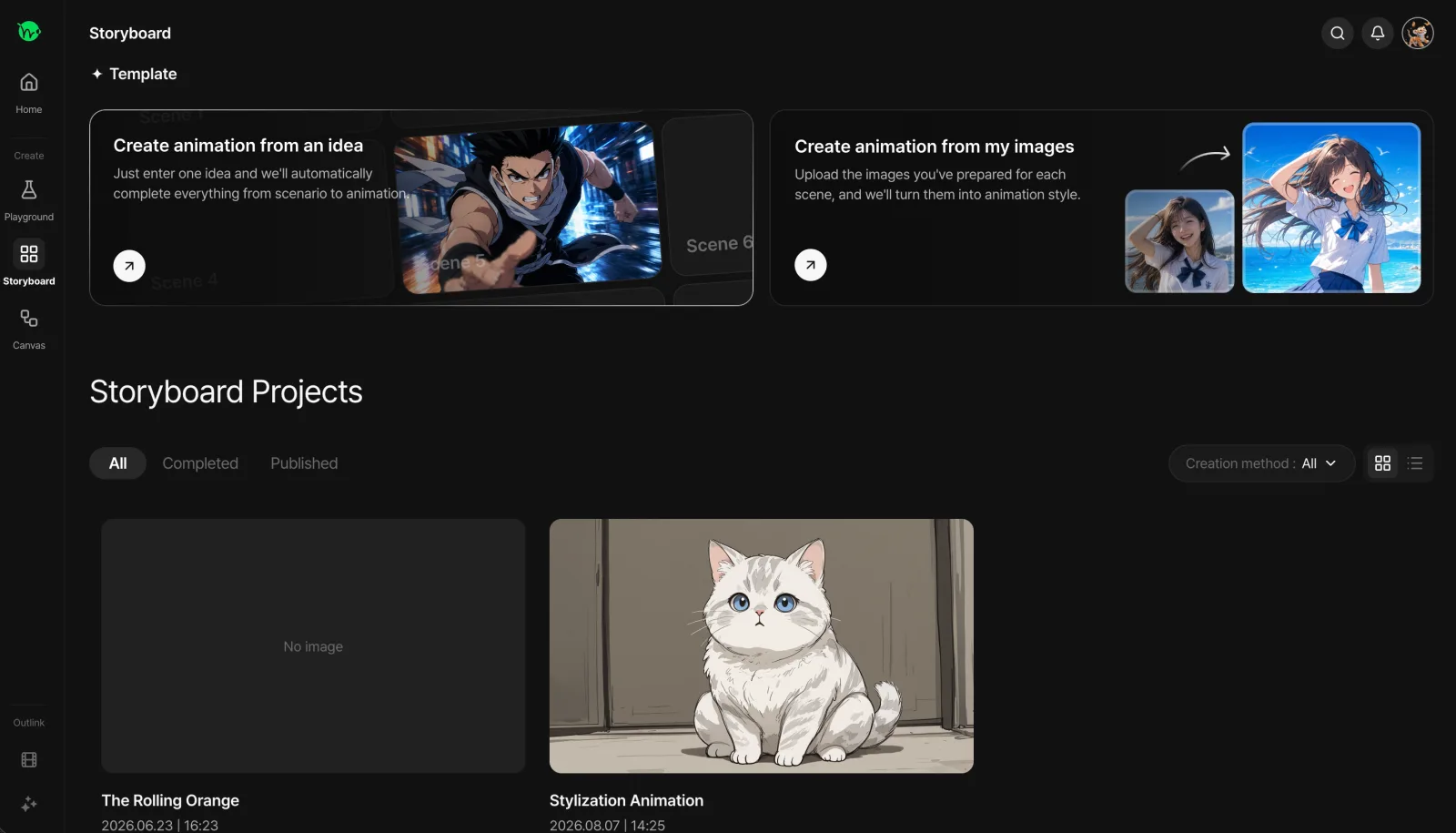
On the Storyboard page, you can use the buttons in the top banner to turn your own story ideas and scenarios into animations, or apply an animation style to images you already have.
Whether you have an idea in your head and want to turn it into an animation, or already have an image you'd like to animate, you can choose the workflow that best fits your needs.
At the bottom of the page, only animations created through the Storyboard are displayed, making it easier to manage and browse your story-based creations without mixing them with other projects.
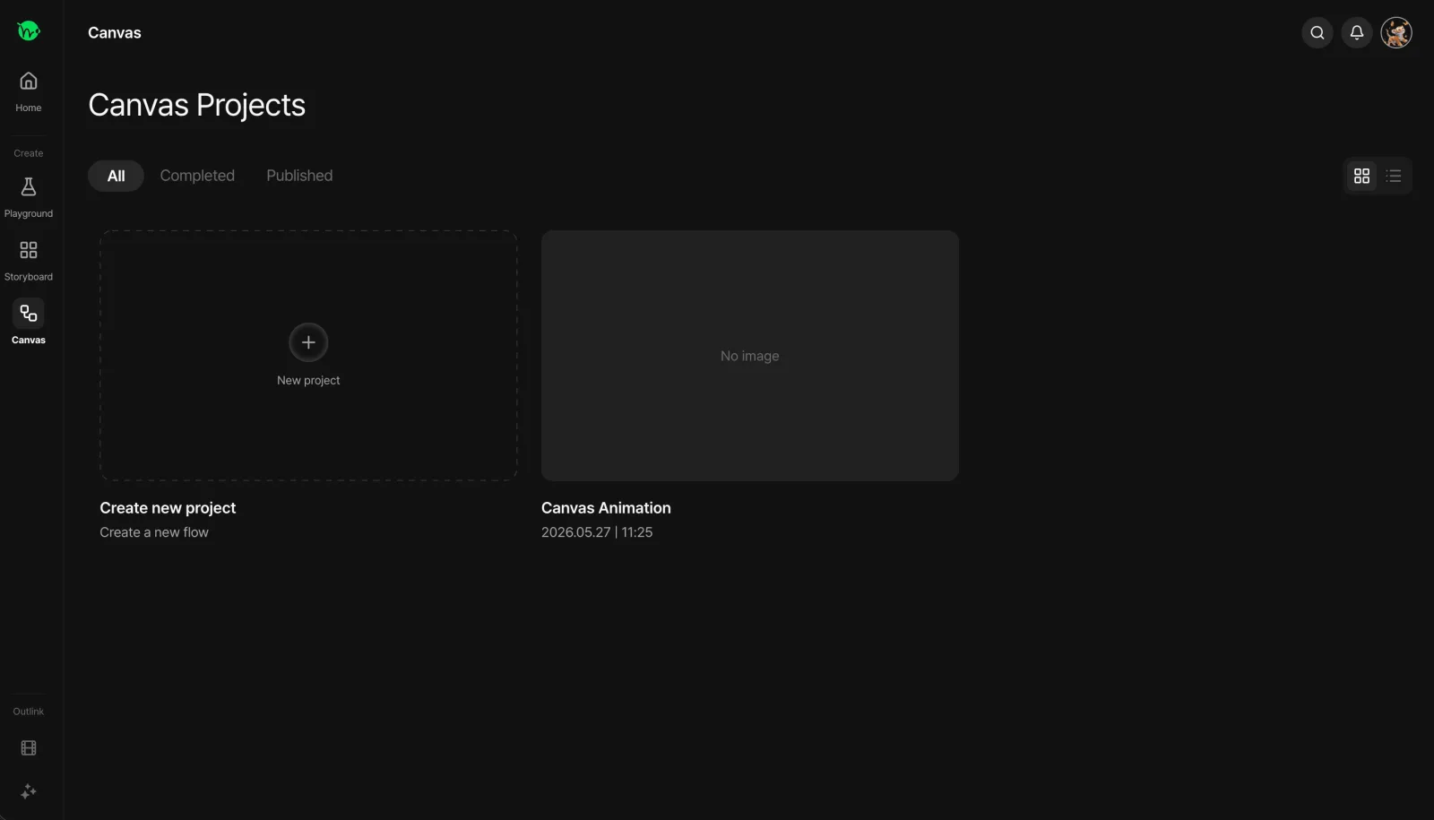
On the Canvas page, you can create animations using a node-based workflow, and you can also view all of your Canvas projects in one place.
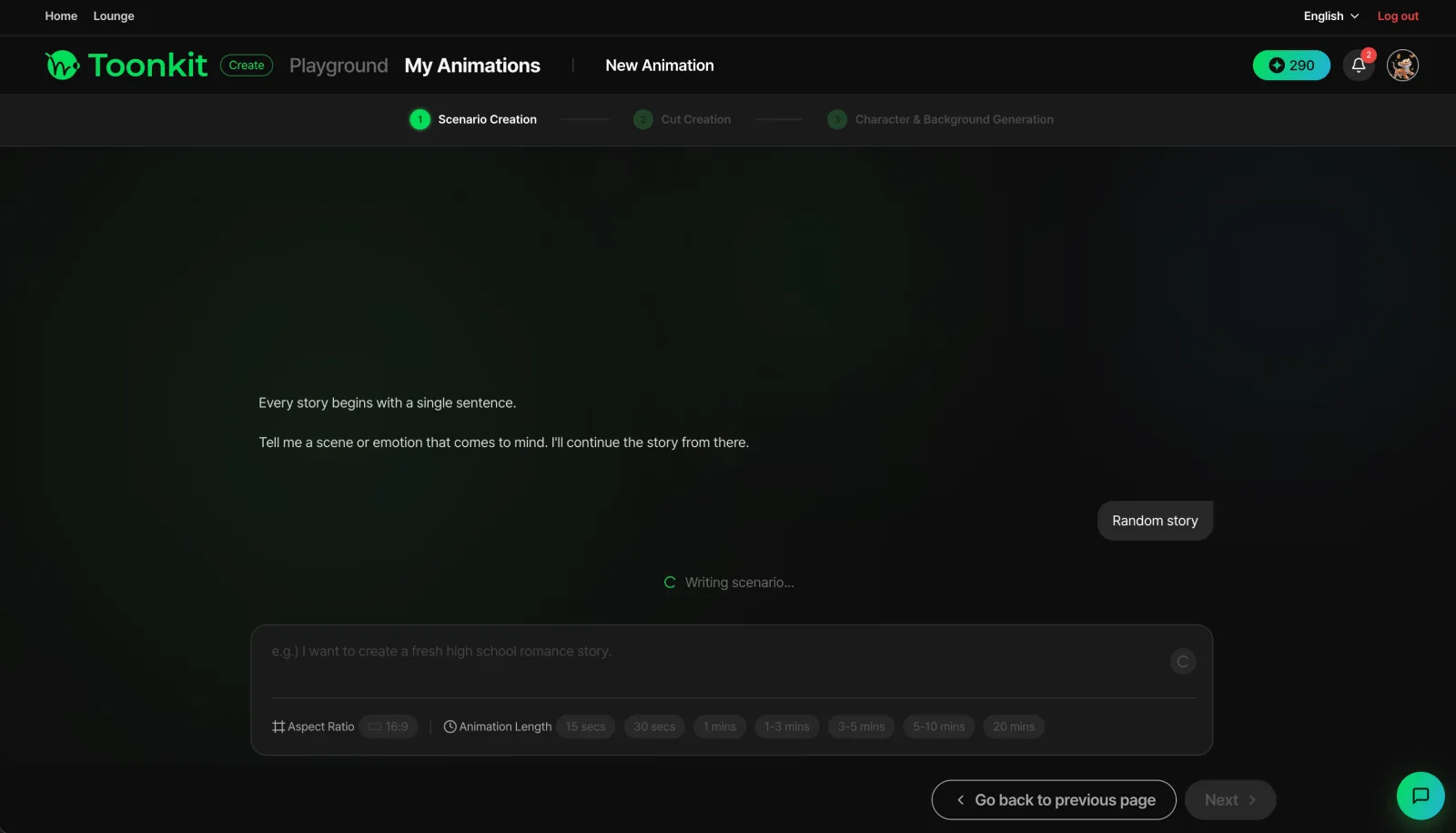
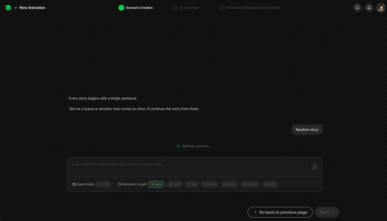
The image above shows the previous project start screen, while the image below shows the redesigned version.
Previously, the two-row header navigation remained visible even after entering a project, which could make the screen feel visually busy and distract from the actual workspace.
With the redesigned interface, the sidebar disappears once you start working on a project, leaving only the information you need in the header. By minimizing unnecessary menus and elements, we've created a more focused environment where you can concentrate on your work.
This also creates a clearer distinction between the "lobby," where you explore and select your projects, and the "workspace," where the actual creation takes place. Once you select a project and enter the workspace, you'll get a stronger sense that you've moved into a dedicated space to focus on creating.
Now that you've seen the newly improved Toonkit, what do you think?
Do you feel that the new UI is more convenient and evolved compared to the previous version, or are there still areas that feel like they could be improved?
This redesign is just one step in our ongoing effort to create a more convenient and enjoyable environment for your creative work. We hope that even the smallest changes will make your animation creation process a little easier and more enjoyable.
If there's anything you found inconvenient, any features you'd like to see added, or any improvements you particularly liked, please feel free to share your thoughts through the "Send Feedback" button in the header.
We'll continue listening closely to your feedback and working to create a better creative environment for everyone.
Thank you for being part of Toonkit!
Was this article helpful?
Your feedback helps us create our next article.
More to read
View all ›
Toonkit BTS ep.2: Sample Assets
Behind Toonkit ep.2 introduces Sample Assets: hundreds of free character and background presets that teach users what a good reference image looks like and let them build characters without spending credits.
Team Toonkit48 views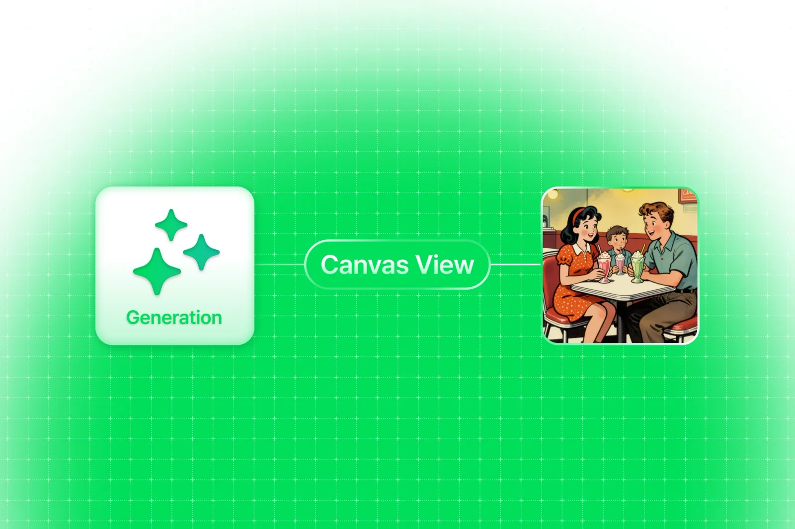
Keeping Dozens of Nodes and Connections Organized
Behind the design of Toonkit's new Node Canvas: how we structured cards into header, content, and toolbar sections, color-coded connections by data type, and hid controls until needed to keep dozens of nodes easy to scan.
Team Toonkit42 views
Toonkit BTS ep.1: Start templates
Behind Toonkit ep.1 covers the Start Template screen shown when creating a new animation, and how splitting it for Story vs. Stylization users cut support tickets over 50% and dropped bounce rate below 20%.
Team Toonkit64 views