Behind Toonkit
Keeping Dozens of Nodes and Connections Organized
 Team ToonkitViews —


Behind the Design: Node Canvas
Hi, we're the Toonkit team.
In this update, we're introducing a brand-new Node Canvas—a workspace designed to make the animation creation process more intuitive and organized.
Today, we'd like to share the thinking behind the design and how those ideas shaped the UI.
Keeping Dozens of Nodes and Connections Organized
The Node Canvas is where every animation project begins.
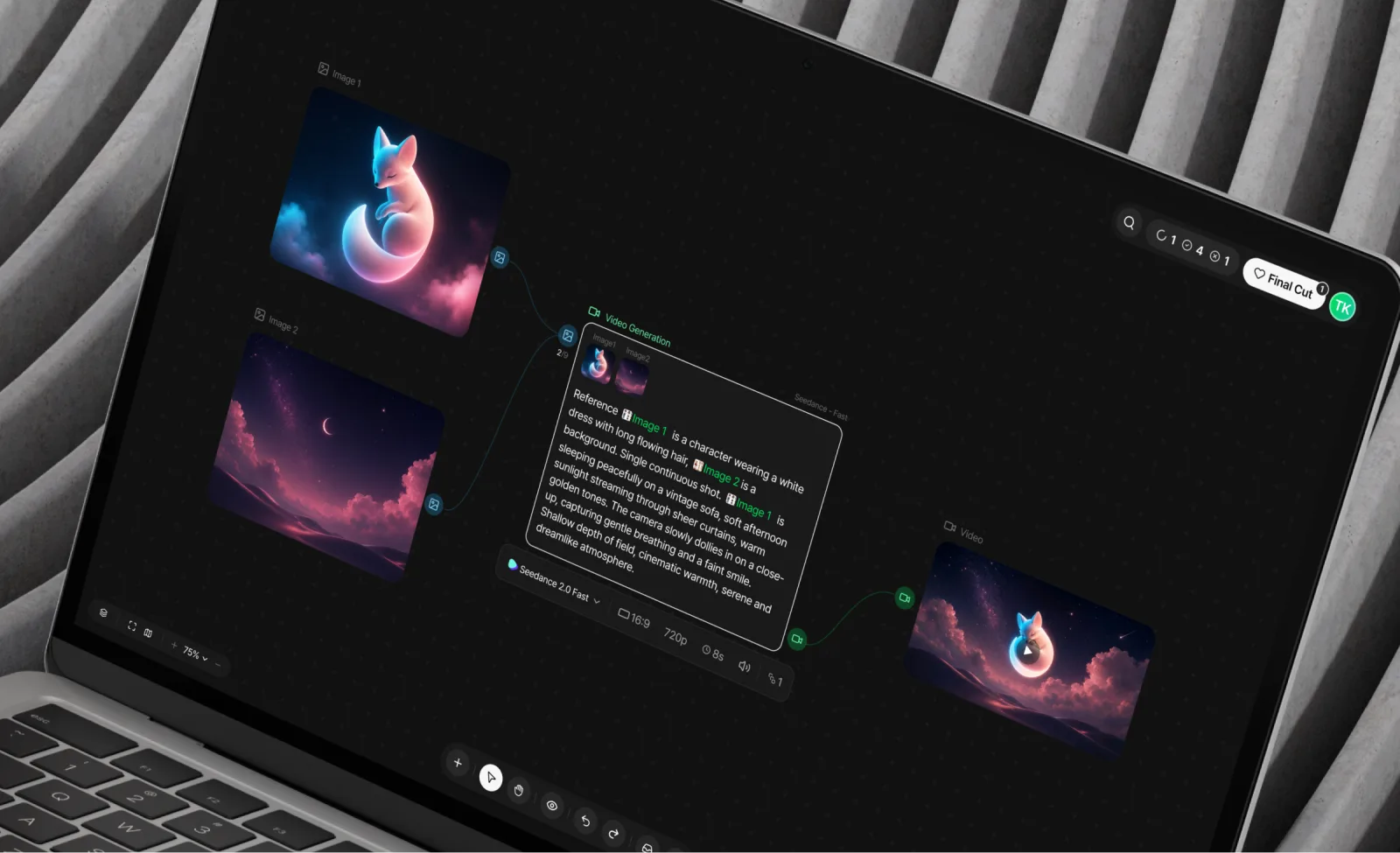
As you write scripts, generate images, and connect videos and audio, your canvas naturally fills up with dozens of nodes and connections.
As projects grow, so does the complexity of the workspace.
From the very beginning, we designed the Node Canvas around one simple principle:
"Keep the interface visually simple, even as the information grows."
 2. 캔버스뷰.png
A Card Structure That's Easy to Scan
Each node contains a lot of information—its title, prompt, status, settings, and generated content.
Trying to fit everything into a single block quickly made the interface difficult to scan.
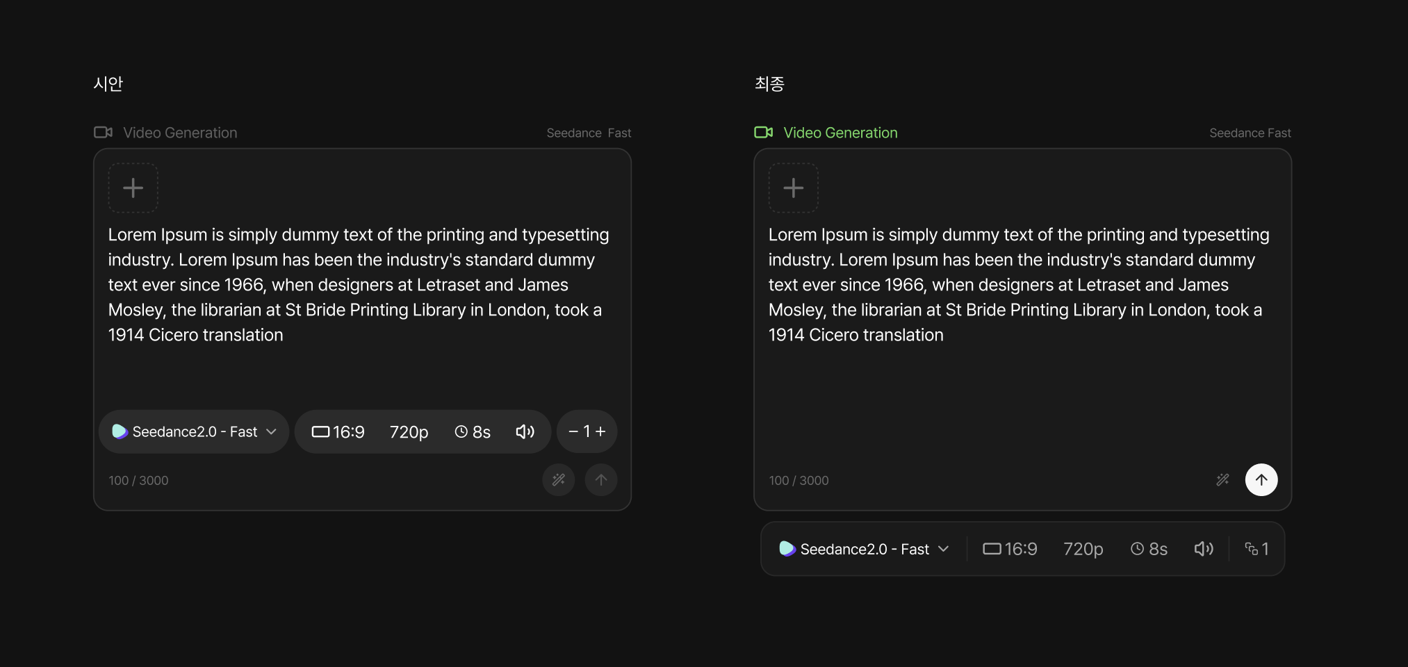 image.png
To make each node easier to read, we divided it into three clear sections:
- Header — Node name and model information (such as ChatGPT or Seedance)
- Content — The main workspace for images, videos, prompts, and other generated results
- Toolbar — Frequently used actions such as generation, editing, and settings
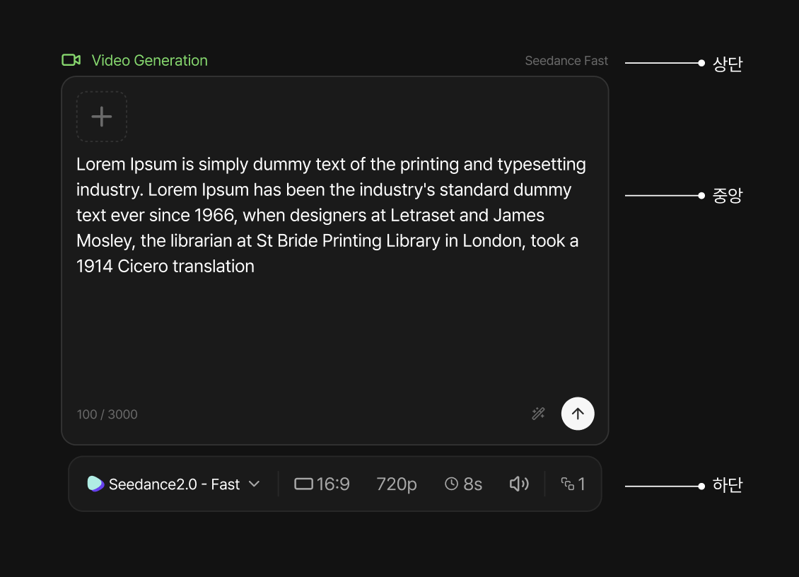 image.png
Settings like model selection, aspect ratio, video duration, and image count (up to four images) are all grouped inside the toolbar, allowing the content area to focus entirely on the creative output.
Separating content from controls makes each node easier to understand while keeping frequently used actions within easy reach.
Giving Connections Meaning
Connections are more than just lines—they represent the flow of data throughout your workflow.
Instead of using the same style everywhere, each data type has its own visual identity:
- Yellow for Text
- Blue for Images
- Green for Video
- Purple for Audio
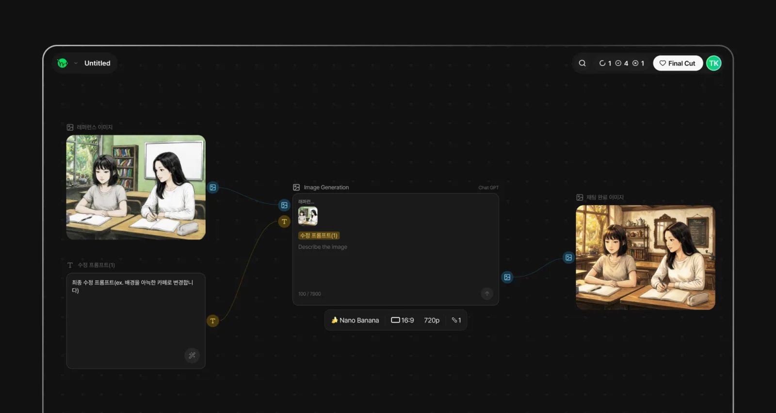 image.png
Connection ports use the same color system and include small icons that represent each data type.
This makes it easy to understand how information flows across the canvas without having to trace every connection manually.
Here, color isn't decoration—it's information.
Showing Controls Only When You Need Them
Each node includes interactive elements such as connection ports, add buttons, and menus.
Keeping all of these visible at all times quickly made the canvas feel cluttered.
Instead, these controls stay hidden until you hover over or select a node.
By revealing interactions only when they're needed, the interface stays cleaner and allows creators to focus on their work instead of the UI.
Focusing on the Active Workflow
As the number of nodes increases, it becomes harder to understand which workflow you're currently editing.
To solve this, selecting a node highlights only its connected nodes and links, while everything else fades into the background.
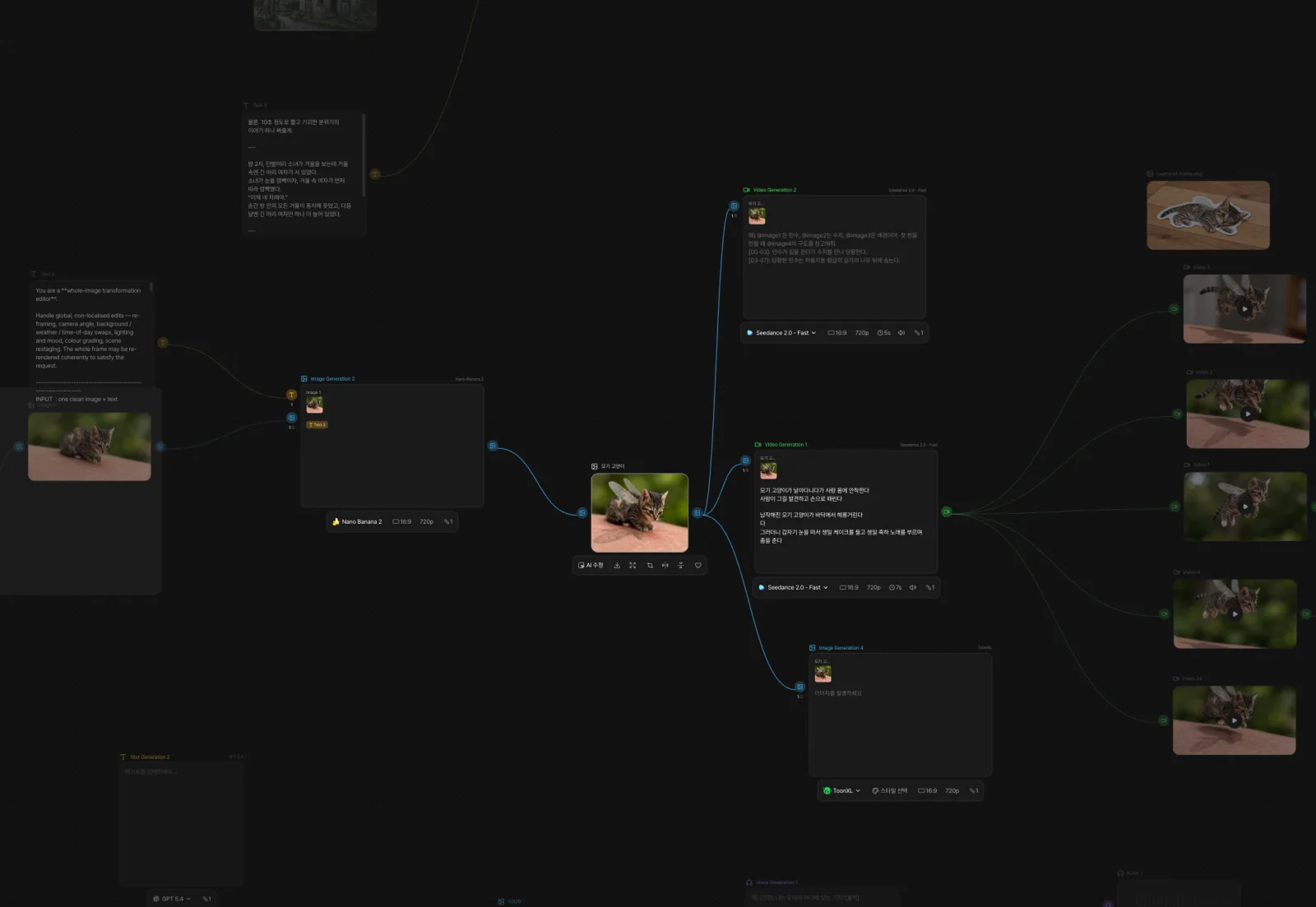 image.png
Instead of tracing connections one by one, you can immediately understand the active workflow at a glance.
In a complex workspace, helping users focus on what's relevant is often more valuable than showing everything equally.
Designing by Removing, Not Adding
The Node Canvas will continue to evolve with new features over time.
But as functionality grows, we believe the bigger challenge isn't adding more—it's knowing what to simplify.
Making information easy to scan, showing controls only when they're needed, and keeping the current workflow clear have been the guiding principles behind this design.
We're continuously improving the Node Canvas, and we'd love to hear your thoughts.
If you have feedback, suggestions, or features you'd like to see, please let us know.
Your input helps us build an even more intuitive workspace for creating animations.
Was this article helpful?
Your feedback helps us create our next article.
More to read
View all ›
Why We Chose Dark Mode and Green
Making generated content the center of attention through a new visual identity.
Team Toonkit58 views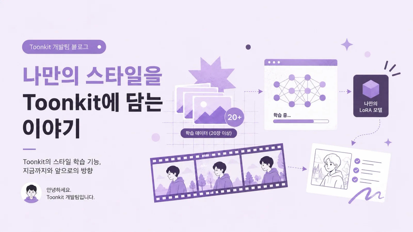
What If You Could Create AI Animations in Your Own Style?
How Toonkit moved beyond ToonXL's preset styles to let users train their own LoRA on 20+ reference images, and how that training pipeline runs on AWS Batch—plus current limitations and what's next.
Team Toonkit75 views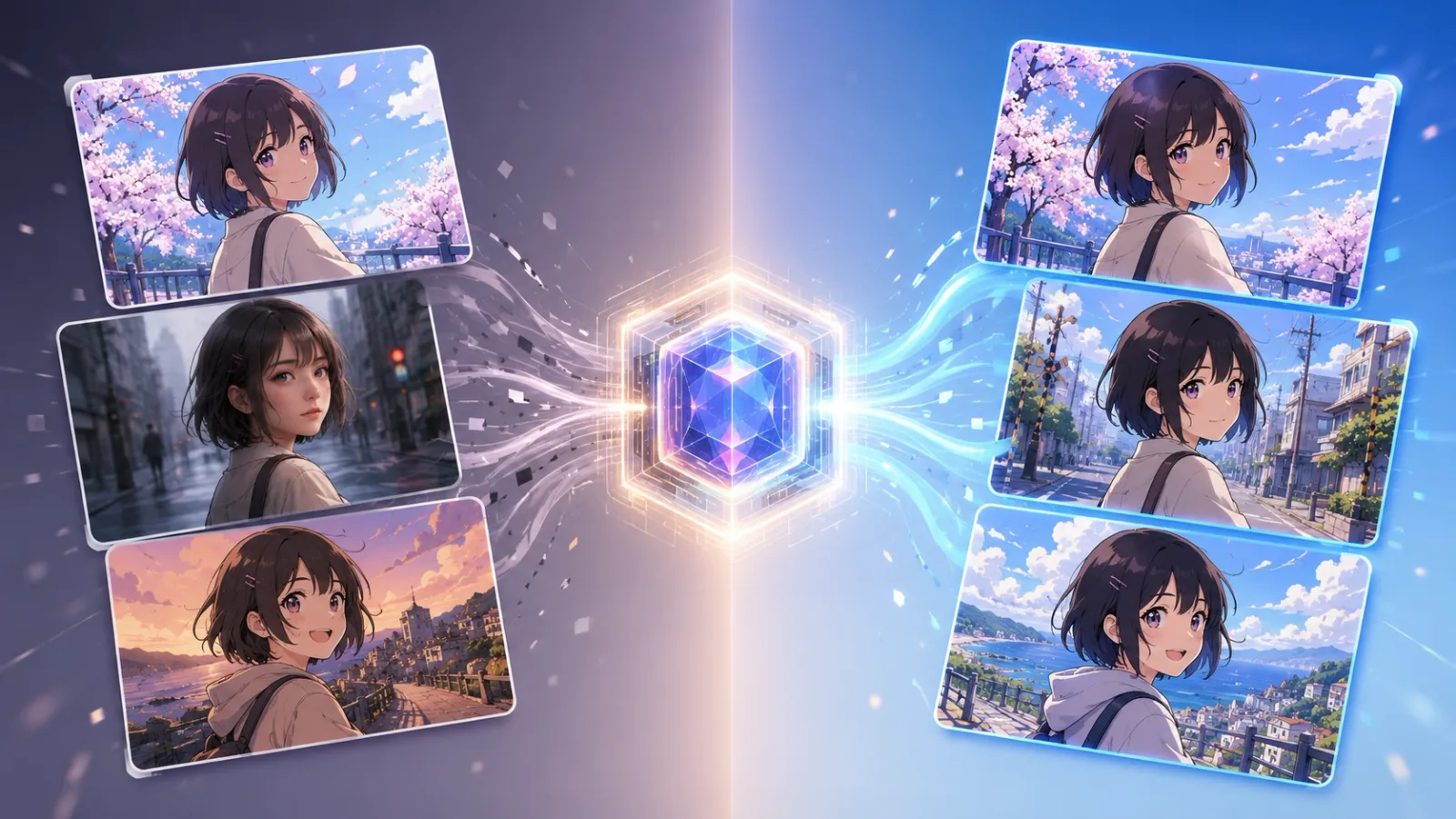
Can ToonXL Solve the Style Inconsistency Problem in AI Image Generation?
A simple look at why AI-generated styles can shift between cuts, and how ToonXL helps keep them consistent.
Team Toonkit97 views