Behind Toonkit
Why We Chose Dark Mode and Green
 Team ToonkitViews —


Hello from the Toonkit team.
If you've visited Toonkit recently, you may have noticed that something feels different.
That's because we've refreshed both our brand color and the overall UI design.
This redesign wasn't simply about making the product look better. It was about solving a mismatch between the experience Toonkit provides and the impression our interface was creating.
What Was Missing in the Previous Design?
Toonkit is a creative tool for generating AI-powered images and animations.
Users can create characters, design backgrounds, and build scenes to bring their own stories to life.
However, the previous design didn't fully reflect this creative experience.
While the product itself was focused on creation, the interface felt relatively calm and static.
Our previous brand color conveyed stability and reliability, but it didn't fully capture the energy, creativity, and excitement that a creative tool should inspire.
As a result, there was a gap between the experience users had while creating and the impression our interface communicated.
Our Goals for the Redesign
Before making any visual changes, we defined a clear goal:
"The moment someone opens Toonkit, it should feel like a creative tool."
To achieve this, we focused on two key principles:
- Make generated content the center of attention
- Deliver the energy and personality of a creative tool
Why Did We Choose a Dark Theme?
One of the first things we explored was the background color.
After testing multiple directions, we noticed a clear pattern. On lighter backgrounds, interface elements tended to attract more attention. On darker backgrounds, generated images and videos naturally became the focal point.
At Toonkit, the most important thing is what our users create.
That's why we chose a dark theme that minimizes the presence of the interface and allows generated content to take center stage.
This approach creates a more immersive experience and helps users stay focused on their creative work.
Why Did We Switch to Green?
The next challenge was selecting a new brand color.
We explored various options, including purple, blue, and teal. However, many of them shared the same problem: they either felt too common among AI products or too similar to traditional productivity tools.
Toonkit is not just another AI service. It's a creative tool.
We needed a color that could communicate creativity, energy, and originality rather than simply technology.
Ultimately, we chose green because it offered several advantages:
- Strong visibility on dark backgrounds
- Clear emphasis on primary actions and generation buttons
- Associations with creativity, growth, and exploration
- A distinct identity compared to many existing AI products
Looking Ahead
As designers, we still see many opportunities for improvement.
This redesign is not the finish line—it's just the beginning.
If you notice anything that could be improved or have ideas you'd like to share, we'd love to hear from you.
We'll continue refining Toonkit and working to create the best possible experience for creators.
Thank you for being part of the journey.
— The Toonkit Team
Was this article helpful?
Your feedback helps us create our next article.
More to read
View all ›
Keeping Dozens of Nodes and Connections Organized
Behind the design of Toonkit's new Node Canvas: how we structured cards into header, content, and toolbar sections, color-coded connections by data type, and hid controls until needed to keep dozens of nodes easy to scan.
Team Toonkit42 views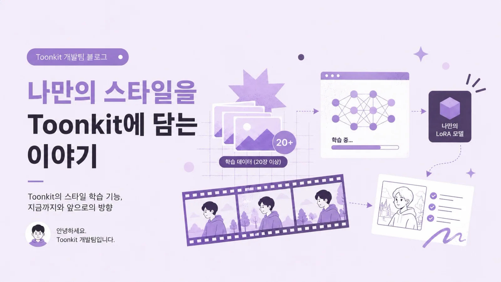
What If You Could Create AI Animations in Your Own Style?
How Toonkit moved beyond ToonXL's preset styles to let users train their own LoRA on 20+ reference images, and how that training pipeline runs on AWS Batch—plus current limitations and what's next.
Team Toonkit75 views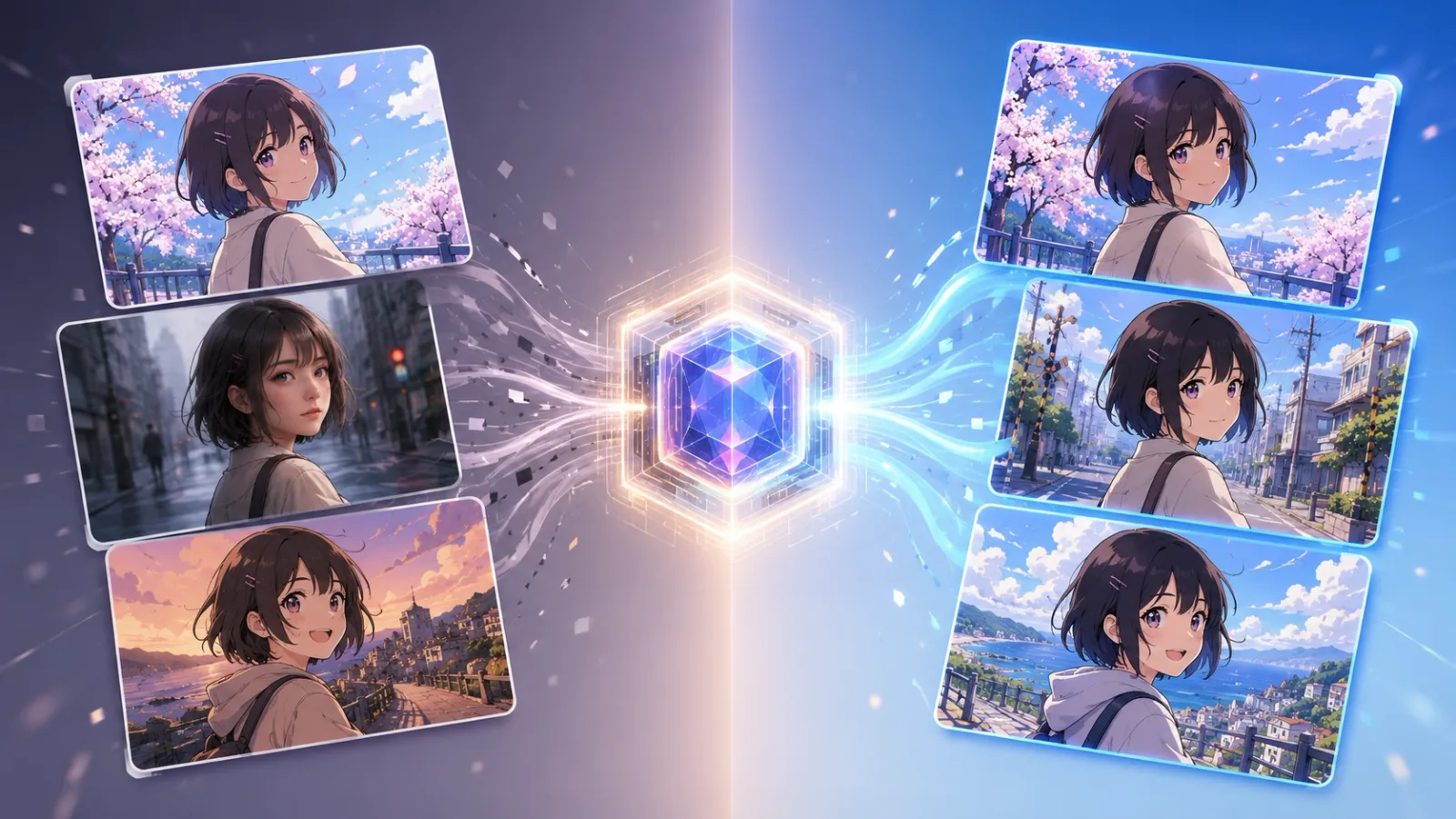
Can ToonXL Solve the Style Inconsistency Problem in AI Image Generation?
A simple look at why AI-generated styles can shift between cuts, and how ToonXL helps keep them consistent.
Team Toonkit97 views